People have strong views on book covers. You can’t please everyone, but surely a cover has one main function- to sell a book? There are endless ‘top 10s’ of ‘great’ covers online: iconic covers, beautiful covers, striking covers and scary covers. But modern titles need to be more than pretty artwork: they need to be discernible in online thumbnails, arresting on a bookshelf and convey the tone, content and genre to a prospective reader. A cover must attract a second glance, intrigue enough to merit a read of the back cover, enticing you to take it home. In my view, in itself it should tell a story. Margaret Attwood agrees – if you pick up a book with spaceships or dragons on the cover it must have spaceships or dragons in it. She calls it proper, ethical labelling. However I also think it’s also great to be unique. There are more subtle ways of indicating genre than repetitive photos of kissing couples on romance novels or distant figures in dark landscapes for thrillers.
Colour is important and has fads. For 2020, Millennial Pink (a dusky rose) is said to be the thing. And colour has meaning. Blue for calm/trust. White for purity. Black for mystery. Red for passion. Green (the rarest book cover colour) is for nature. Should a cover be Monochrome or sport Analogous or a Triadic combination from the colour wheel, be they warm or cool, intense of hue or highly ‘luminant’? The choice is fraught.
I envy ancient writers, Till the 3rd century, clay tablets and papyrus had no need of covers. After this, parchment texts were sacred, precious, handwritten and swathed in silk or leather-bound, embellished with gems and precious metals. By 1450, printing shot European books from around an estimated 15 million to 200 million+ in 100 years, though texts (codex) were still bound in leather with clasps and strings. By the 16th century, books became more profane, smaller, still with hard cover, now perhaps bearing a title on the edge. The norm was an end ‘colophon’ with printer’s name, date. But by 1520 when it migrated to the front page. Marbled paper appeared. For many 18th-century books you bought your codex and had it bound to your wish. By 1820 the machine press reduced the cost so finished books were commonplace. Yet you might have illustrated gift covers painted in watercolours, on silk or tissue paper
What you could put on a cover depended on your prevailing technology. Hand-tooling needed expensive labour, but in the mid-1800s books often had gold illustrations on fabric over board, with titles on the front. After chromolithography, more colour was possible. Permanent covers often had a medieval slant, though some still had marquetry and precious metals. Then came a revelation. Cheap books.
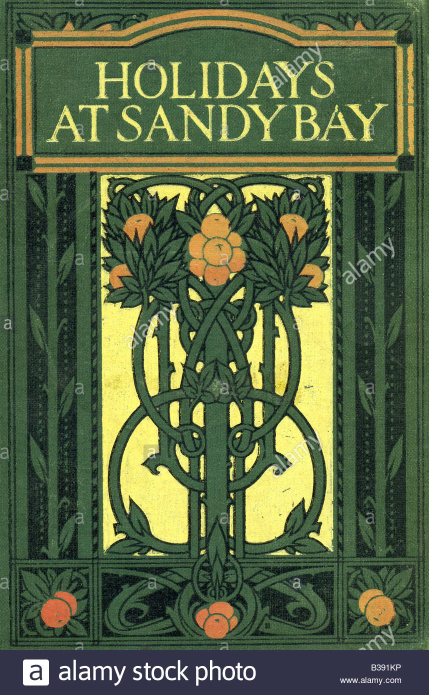
Penny Dreadfuls and Yellowbacks (from their cheap wood paper) appeared 1840s onwards: smaller books, with thin card covers, on sale in railway stations as the people took to trains. These paperbacks were mostly daring tales of pirates, ghosts or knights. Wood engraving techniques from Japan and photogravure methods meant hand-engraving was passé. By 1894 an Art Nouveau influence crept in after e.g. Mucha and Aubrey Beardsley with his iconic The Yellow Book for artists poets and writers, a magazine daring visually and conceptually involving a bit of decadence, dandyism, symbolism, naturalism and feminism. If earlier book covers were often symmetrical front and back over the spine, by 1900 they were asymmetric., like Peter Rabbit: front cover visuals, paper on fabric hard covers.
By the First World War, literature art tended to propaganda with cheaper comics, magazines and the birth of advertising. The motifs more Cubist, Soviet-influenced (eg Alexander Rodchenko) or decorative. Post WW1 came the avalanche of paper-jacket, genre-specific illustrations e.g. detective novels. Like everything else, there are fashions for book covers. Most of us could guess the decade of a book enprint by its cover. Some iconic designs today fetch huge sums.
After WW2, handcrafted illustrations predominated in the 50s, text in the 60s, and vibrant graphics in the 70s with advancing printing techniques. By the 80s, text and special effects came into play. The web offers many shortlists considered iconic eg The Godfather (Gothic script/puppet), Clockwork orange (the Cog-eyed Droog, Favey, 2008), Psycho (Black and white), Jaws (definitely what it says on the tin!)
Late 19th century brought recognisable design branding for publishers like Penguin, then for individual authors, but trends continue to evolve. This century has seen contrasting fonts, odd-angled text placement, minimalism, text containing texture or placed inside illustrations, small elements (tiny boat/figure), big skies, moonlight, interwoven elements, photoshopping substitution and superimposition (e.g. Cruel Beauty), centred artwork or collage elements.
For my part, in my last bookshop browse, I was struck by how many covers had tiny boats/red-jacketed people, mist, skylines, silhouettes, central medallions, crowns or swords, Triptychs, bridges with trains, female heads, nostalgic photos, flowers and torn paper edges (though I love The Goldfinch)
A cruise through graphic design websites suggests next decade trends are: Bold Text (retro 70/80s), Cartoon Graphic, Single Object, Rainbow Colours or Minimalist Monochrome, Overlapping image/text, Hand-written font, Delicate artwork or ‘ Collage of found materials.’ Stateside they favour embossing/foil, messy covers and pink.
Think I’m not for pink. It’s not woke. I opted for drama in my latest. My survey had 80% picking black and red for my crime book. Attwood should approve.
Leave a Reply
You must be logged in to post a comment.